Murals Art Workshop: Continuing the Murals
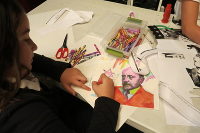
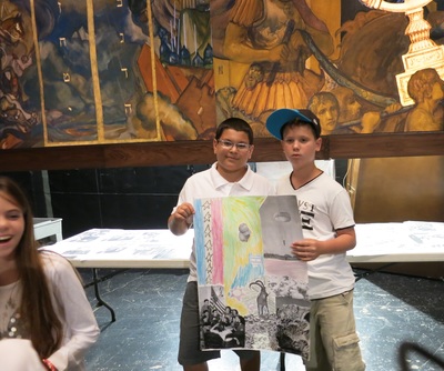
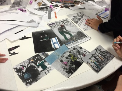
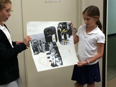
In this art workshop students reflect on the images of modern Jewish life and history that were not included in the mural when it was completed in 1929. Students will create collaborative collage posters which continue the imagery of the mural. Using historic black and white photos, students will compose their own dramatic compositions, add color and their own creative imagery, to create new mural panels which envision what Ballin’s mural might look like if he continued it to include these significant Jewish events.
Discuss
The images selected for the mural in 1929 were the decision and choices of Rabbi Magnin and artist Hugo Ballin; it is by no means a complete depiction of Jewish history. What additional chapters might have been included?
Importantly, these murals were painted in 1929 before significant historical events that impacted the world, and the Jewish people in particular. What events are missing from these murals? (Notably, mass immigration to America from Eastern Europe in the 1880’s, World War 2 and the Holocaust, and the establishment of the State of Israel) What would additional panels look like if they mural was continued to the present time?
Materials
- Multiple copies of black and white historical photos of Jewish history. Click here for images to download. When making copies, enlarge to different sizes so there is a choice about the size of the image details.
- Assorted colored crayons
- Scissors-- 1 per 2 students
- Glue sticks --1 per 2 students
- Large sheets of poster size paper--preferably 18" x 24' --one per 4 students.
Activity
- Students will create collage posters that illustrate chapters in Jewish life that continue the timeline of the mural. These chapters could include the great wave of Jewish immigration from Eastern Europe to America in the late 1800's, World War 2 and the Holocaust and the establishment of the State of Israel. Other chapters can be added as well.
- Place materials on tables with a collection of assorted historical images.
- Review the principles of composition below and analyze one of Ballin's painting with these principles in mind.

When designing your collage consider the COMPOSITION
of your work.
In his Notes of a Painter, Henri Matisse defined composition as, "The art of arranging in a decorative manner the diverse elements at the painter's command to express his feelings."
When analyzing a work of art take note of how your eye moves around the object. Where does your eye go first, and why were you attracted to that part of the image? What colors, textures, and shapes appear in the image? What did the artist include in the composition to guide your eye or to direct your gaze to a certain part of the image? (Source: ARTSEDGE )
Composition Principles
Click here for more details from ARTSEDGE
Balance is created in a work of art when textures, colors, forms, or shapes are combined harmoniously.
Contrast is the use of several elements of design to hold the viewer's attention and to guide the viewer's eye through the artwork.
Movement is the way a viewer's eye is directed to move through a composition, often to areas of emphasis. Movement can be directed by lines, contrasting shapes, or colors within the artwork.
Emphasis is created in a work of art when the artist contrasts colors, textures, or shapes to direct your viewing towards a particular part of the image.
Pattern is the repetition of a shape, form, or texture across a work of art.
Proportion is created when the sizes of elements in a work of art are combined harmoniously.
|
Conduct a Visual Analysis of a Mural Image
Click on this mural image to enlarge and project it, or hold up the laminated version. Discuss together how the principles of composition described above apply to this image. As the students' collages are a continuation of Ballin's work, consider these additional aspects of his painting:
|

To Complete the Collaborative Mural Collage Students:
- Select the images they want to tell their visual story
- Cut them out so they have different sizes of the images they want to use.
- Experiment with the composition by moving them around on the paper in relation to each other.
- Think about contrast and emphasis and proportion when finalizing their arrangement; consider which images are in the foreground and background and how and where the viewer's eye will be directed.
- Color the black and white images with crayons selecting colors to create balance and contrast.
- Finalize the composition and glue the images to the poster.
- Add additional designs, images, symbols to create patterns, movement and elements of surprise!
- Present their mural collage posters to the class and mention the design choices they made.


